Product
Network instance
Product designer
December 2021 - March 2022
Abstract
A network operator needs to quickly find and report errors in network instances to get the instance fixed to keep customers happy.
Who
Network operators that need to monitor multiple network instances for hours a day
What
A faster way to spot errors and where the errors are.
Why
Errors are severe and as soon as they appear they need to be spotted and reported in order to mitigate severe network problems
Impact
Any network performance issues will be solved faster
My contributions
UX Design: I led the all of the UX tasks for this product feature here by meeting with product managers and technical architects to understand the need and technical limitations, I facilitated a workshop to understand our target user and what tasks will this feature aid and complete for our user and lastly led product discovery and research about 5G networks to see if this is a viable use case for the product feature.
UI Design: I designed the dashboard page low to high fidelity and the first iteration of the details page which I then handed off to another designer to take in high fidelity and gave feedback to make it align with the user needs and Carbon Design System
Visual Design: Annotated all of the dashboard page and co annotated the details page, created a document with all components developers need for the page and held weekly developer sessions so we can ask questions about the design.
Overview
This product started as a concept for a specific client who needs a way to view a network instance getting instantiated. I led the design of this feature and had it built in 3 months from the concept to development. I worked with another UX designer on this product and kept my manager and my senior designers in the loop.
Jobs to get done
Map out requirements
Knowledge gathering
Weekly session with architects
Design workshop
Alignment across team
Ui Design
Prototype and iteration
Hand off
All UX states, annotation, red lining and documentation
Nothing!
The current experience for a user was using their CLI terminal, no interface.
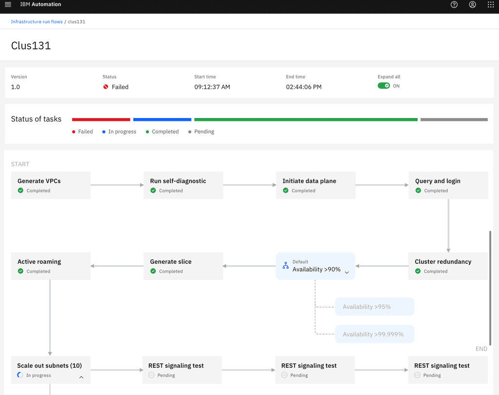
Workflow interface
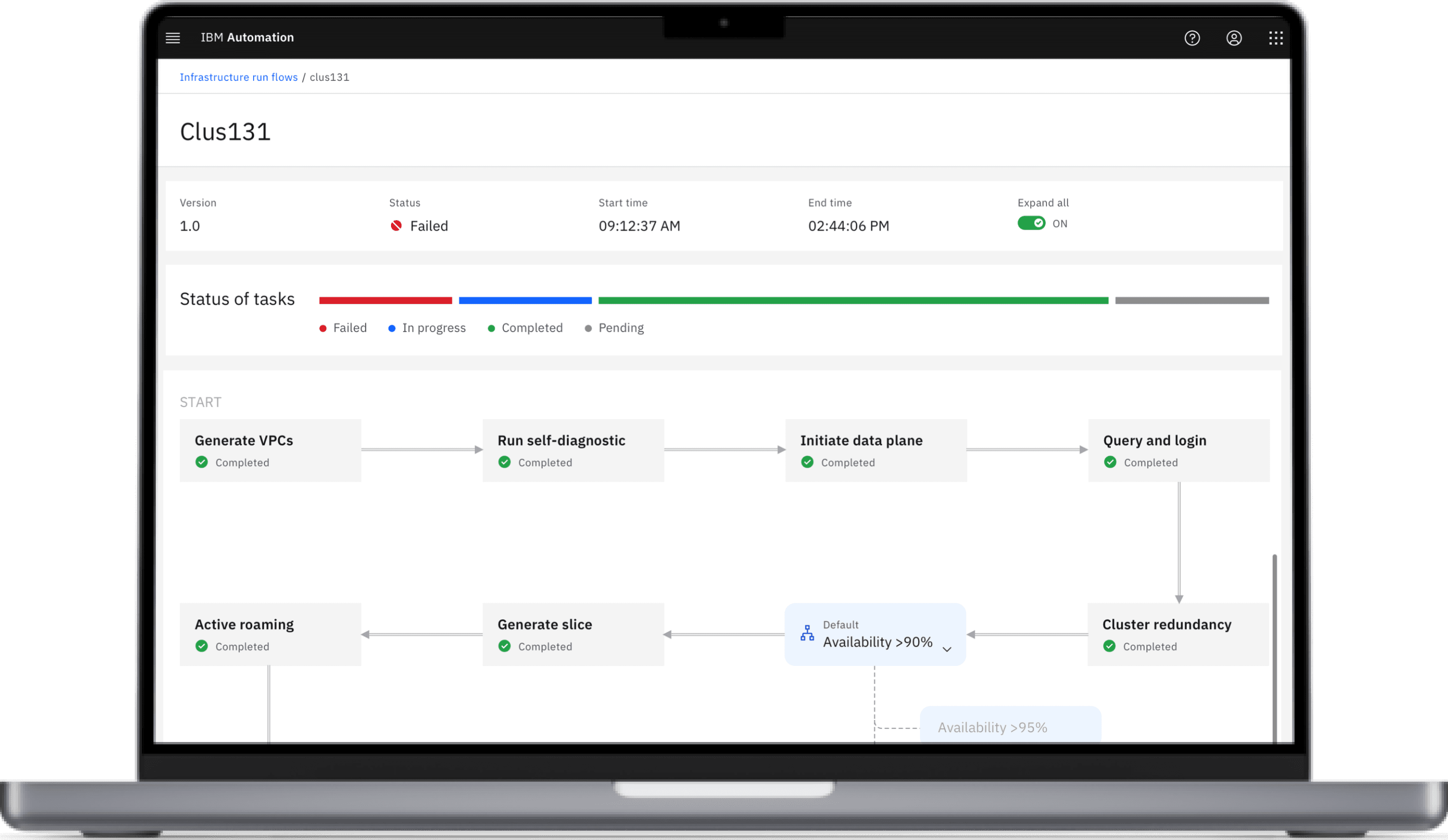
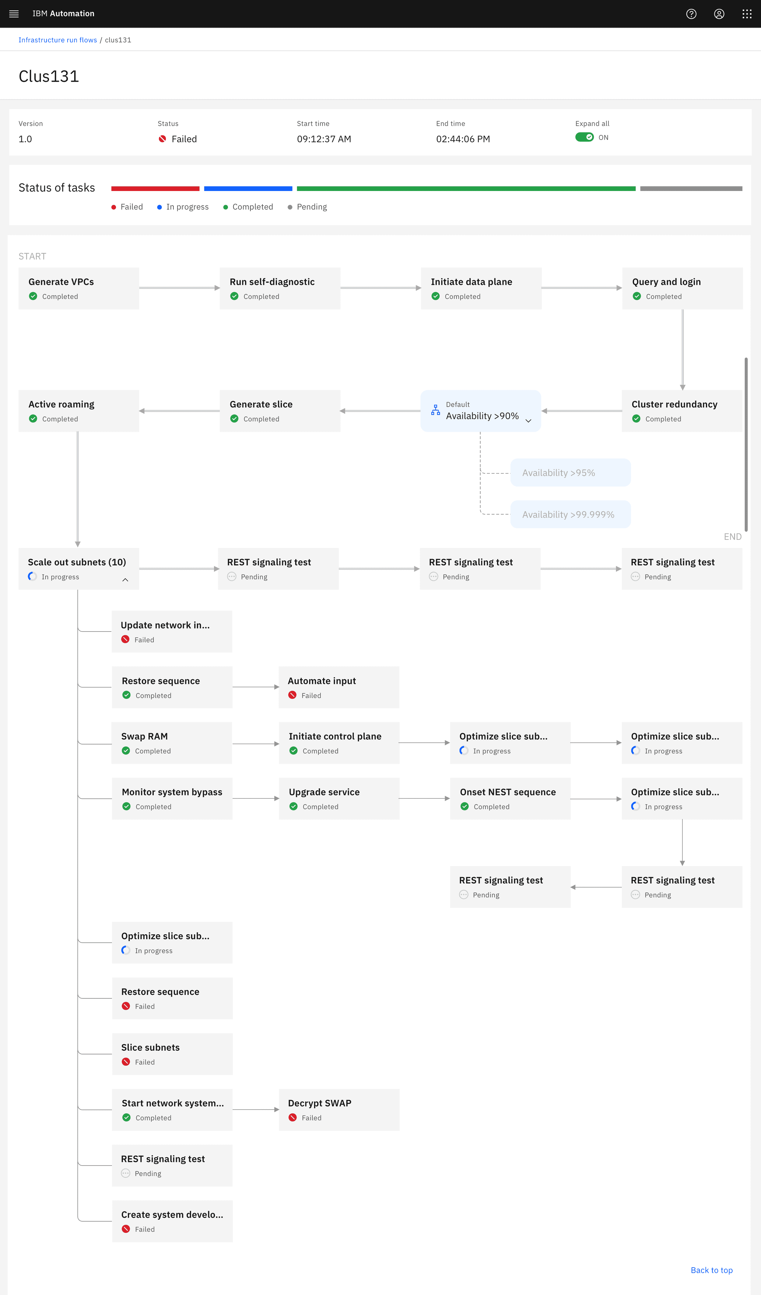
Now they can quickly see status of a network and pinpoint where something went wrong
Work flow view
A network operator is able to quickly see where in the instantiating process an error occurred and can quickly report it to a colleague.
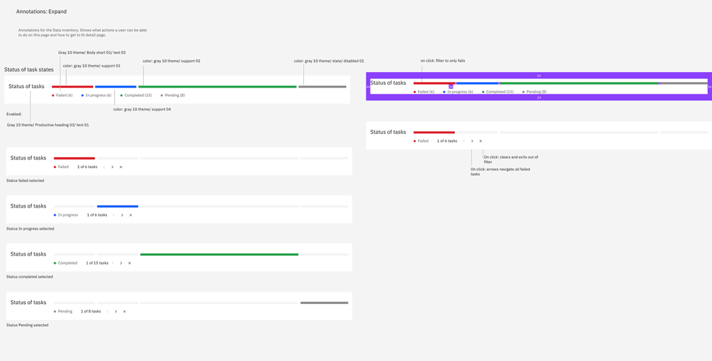
Redlining
We made a customer component to show the amount of completed and failed steps the network went through.
Reflection
This was my first project I led and looking back at my performance, I learned how to become a better design advocate. If I did this project again I would spend more time asking PMs on the roadmap and spend time pushing for more customer time and validating the need for this feature.
Portfolio 2024
United States


