Product
Hybrid Cloud Mesh
Product designer
August 2022 - October 2022
Abstract
Hybrid Cloud Mesh is a SaaS product for enterprises to manage and monitor both public and private clouds on a single platform.
Who
Cloud operation engineers need a quicker way to set up clouds for development engineers to connect and monitor them.
What
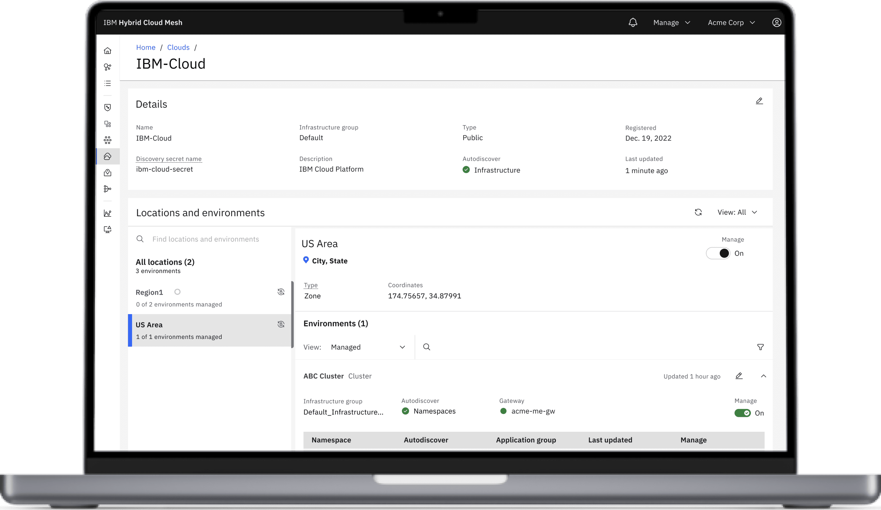
Hybrid Cloud Mesh is a SaaS tool for businesses to manage and monitor both public and private clouds on one platform. The detailed cloud page enables engineers to set up their cloud and view all its infrastructure at once.
Why
This allows development engineers to work independently of cloud operation or network engineers.
Impact
Development engineers can connect applications without waiting on cloud operation engineers, cutting onboarding time from a month to a few days.
My contributions
UX Design: worked with the product design owner and chief architect to understand what are our CloudOps goals, the engineering limitations, and how the first iteration of the ‘Onboarding a cloud’ into the product was made
UX Design: Created a UX flow to navigate the click path of the cloud page and to the rest of the product. Determining this is the first task Clyde will be doing and how this can be streamlined. Lastly mapped out the UX flow of the ‘Register a cloud’ tearsheet
Visual Design: created 3 iterations of the Cloud details page, ‘Cloud Edit’ tearsheet, and cloud list view
Overview
This page is part of a more extensive product, Hybrid cloud Mesh, that was released under IBM Automation in the Winter of 2023.
Hybrid Cloud Mesh gives a way for CloudOps engineers and DevOps engineers to work together and manage multiple clouds on a single platform.
The page I individually designed was the Cloud Details Page. This page would be used by a CloudOps engineer during their first task in the platform. The concept for this page was a CloudOps engineer can set up the cloud and basic settings for the infrastructures under the cloud.
The question comes in: how can we show a high-level view of a cloud while also creating a one-stop place to manage the infrastructures under the cloud?
Knowledge gathering
Met with technical architects to understand the use cases
Ideation
Brainstorm navigation flows and lo-fi screens
Mid fidelity
Mock up UX flows and prototype
Visual and prototype
High fidelity prototype and playback
Hand off
All UX states, annotation, red lining and documentation
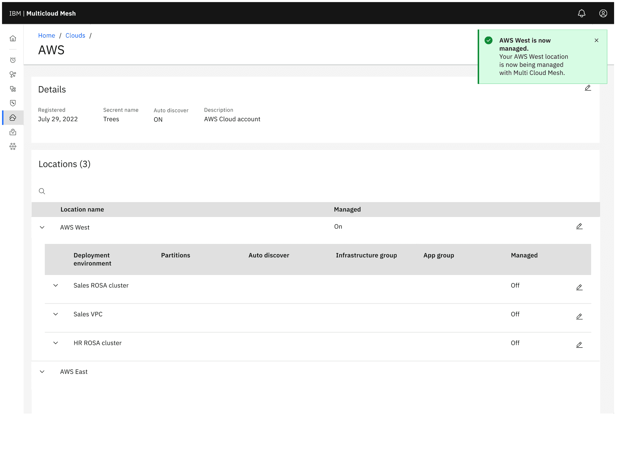
Mockup for an internal demo
A nested data table that required multiple clicks in order to view the complete cloud infrastructure
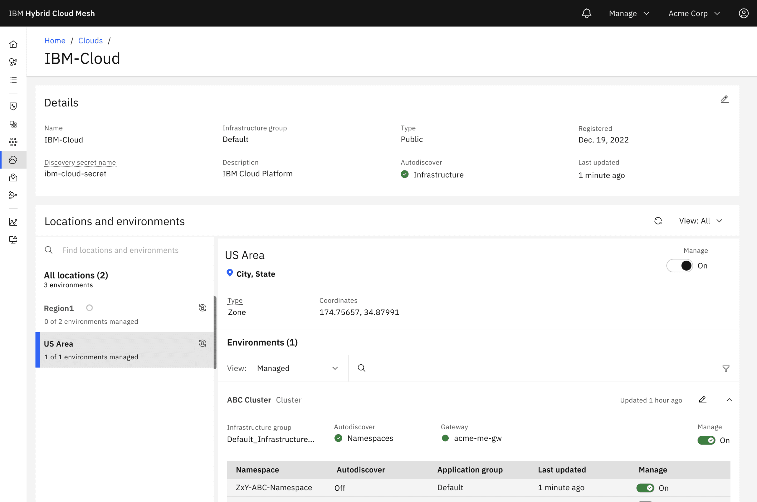
Delivered for our GA
A detail page that sections off the cloud's infrastructure based on what parts of the cloud are set up and what needs attention
Outcomes and lessons
Outcomes
This was successfully green lighted currently in GA
Goal achieved to view a complete cloud with its infrastructure and set it up on a single page
Impact: Initial project completed in six weeks and considered to be pivotal which helped in user testing and product development
Lessons
I would push to be added earlier or see if I can spend more time with a PM on this project. This way I could facilitate a discussion on product roadmap, advocate more on the north star design and future considerations
Portfolio 2024
United States


